


CAIRO, Sept. 30 (SEE)- Decor experts could understand the significance of paint and how to use it in creative ways to improve decoration in rooms.
Here are tips on using paints for this purpose advised by Houzz.com:
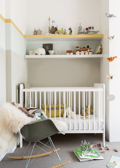
1. Zone vertically. This little nursery nook is soothing and restful yet packed with interest and detail, thanks in part to the desiger’s clever use of paint colors.
Stepping the colors from dark to light gives a cocooning feeling at the lower level that opens up as your eye travels toward the ceiling.
Taking the first color to the lower shelf provides a large wash of the main color behind the crib. Each shelf then acts as a natural point to introduce the next color.
The strip of bright yellow along the edge of the top shelf also provides a streak of sunshine that continues around the room, adding a slim band of powerful color to the otherwise restful scheme.
2. Divide an open room.
How can you separate the different areas in an open-plan space? With directional wall paint! This simple diagonal line pides a calm and restful blue around the bed from a crisp white that demarcates the wardrobe area.If you have an open-plan space that you’d like to carve up into zones, try marking out two or three main areas and then paint each one a color that matches the mood you want to create in the space, be it restful, energizing or playful.
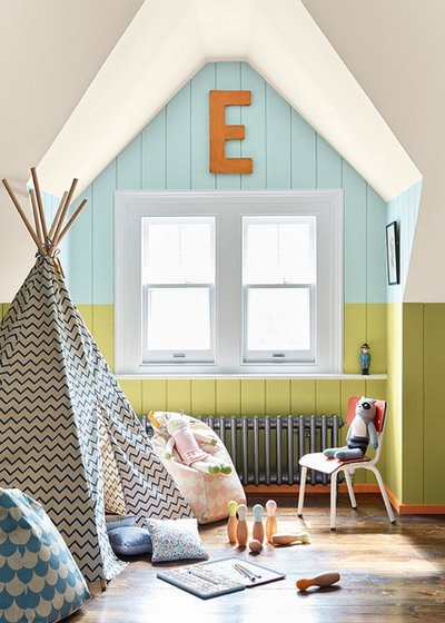
3. Highlight an unusual feature.
This window nook is such a lovely shape that it would’ve been a shame to treat it like just another wall by painting the entire room a single shade.By using color to draw attention to the shape, it becomes a beautiful feature in its own right. And by confining the wash of blue to the beautifully shaped slice of wall in this alcove, it creates a bright and fun play nook, perfect for a children’s room.If the rest of the room had been entirely neutral, however, this splash of blue might have been a little jarring. Continuing the lower wall color into the rest of the room allows the nook to feel like a carefully considered and connected part of the overall design.
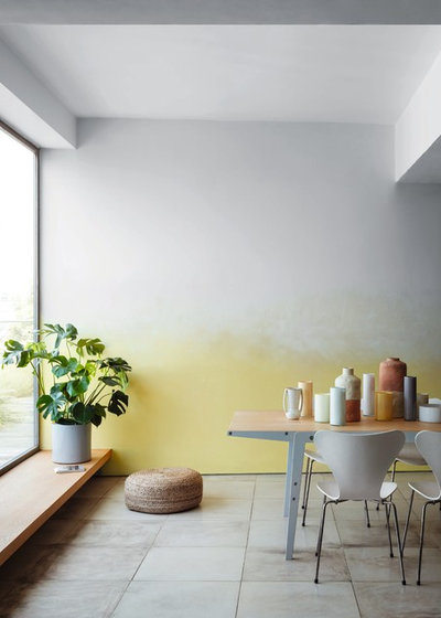
4. Experiment with ombre. If this dark-to-light paint effect gives you flashbacks to the rag-rolling techniques of the 1980s, don’t be scared. Ombre paint effects are a modern update on the textured paint style. When done right, they can help create a fresh and modern room.
This sunshine yellow blends softly into a crisp white to give interest, depth and fun to a plain wall.
If you’re a paint-effect beginner, stick to just two shades. Apply the lighter color first and then blend the darker shade to create a soft and smooth color transition. Better still, find a professional decorator in your area to handle it for you.
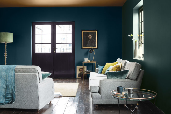
5. Gild the ceiling. The dark blue and green on the walls of this room read almost as one color at first glance, but the interplay adds depth and interest upon closer inspection. The standout feature, however, is the gold-painted ceiling. Often overlooked, the ceiling, or “fifth wall,” is a great place to experiment with color, and the warm gold here creates a cocooning effect.
Another paint trick that can achieve a similar result is to take the wall color and apply a cohesive wash of it over the coving and ceiling, doing away with the sharp line break of white-painted coving or ceiling.
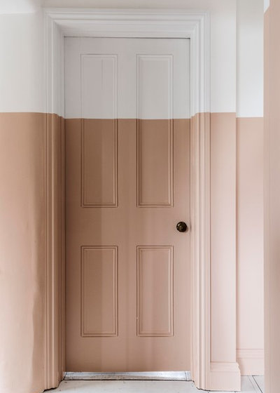
6. Unify with a clean line. These homeowners took a line of color from ground level to halfway up a wall along their landing, and they have fully committed to the look, bringing the half-wall effect right around the door frame and the door itself.
What’s the reason behind this bold move? The house has several types of roof — gable, pitched and flat — so the mismatched ceilings presented a challenge when it came to painting the landing. The couple loved this nude plaster color for the walls, but it would’ve looked quite confusing to use it all the way up the different angles and heights of the ceiling.
By keeping the top section white, they disguised the different ceiling heights to make the space feel more cohesive.
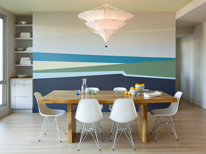
7. Create a mural. What do you see when you look at this wall? A sweep of sandy beach? A wash of ocean blue? Just a few lines of color can result in a fun visual effect and bring life and interest to a flat surface. If you want something that looks like a large-scale piece of art on a shoestring budget, try getting creative with your paint application.
This design could be replicated relatively easily with some planning, a roll of painters tape, a selection of sample-size paints and a dollop of patience. If in doubt, ask a professional decorator to help you.
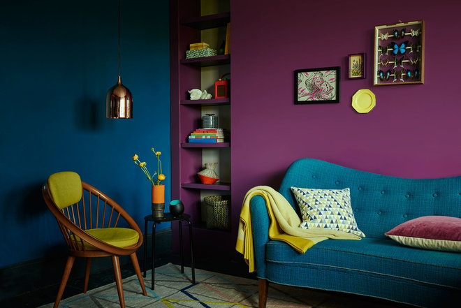
8. Team up power shades. Why have just one feature wall when you can have two? In this dark and dramatic room, a rich purple and a saturated teal cozy up against each other to create a double-whammy of deep color. This works well because they are both the same tone, which means that one shade isn’t lighter or darker than the other — a good rule of thumb when pairing up different colors. Imagine this as a black-and-white photo: These two colors would both read as roughly the same shade of gray.
Dark colors are also a wonderful backdrop for brighter shades and warm metallics. Just look at the way the yellow accents leap out against the blue and purple, and see how the warm copper-colored pendant light glows from the wash of teal blue behind.
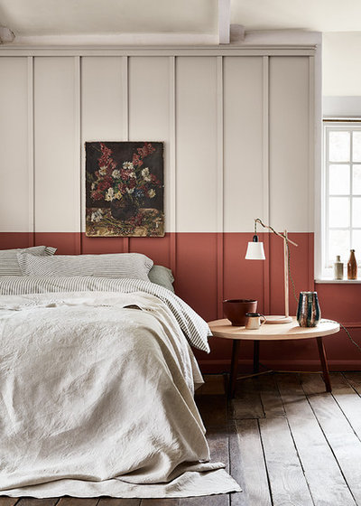
9. Create a headboard. If you take a quick first look at this photo, you might notice the beautiful terra-cotta-colored headboard. Then give it a closer look and you’ll realize that it’s actually just a smart paint trick to mark out a “headboard” on the wall behind the bed in this lovely bedroom.
Carrying the paint effect past the bed also gives the illusion of the headboard paneling running along the lower section of the wall.
To create a similar effect in a bedroom, choose two colors from the same paint family (that is, two warm tones or two cool tones) for a cohesive look. Use the darker color on the lower portion of the wall.


